

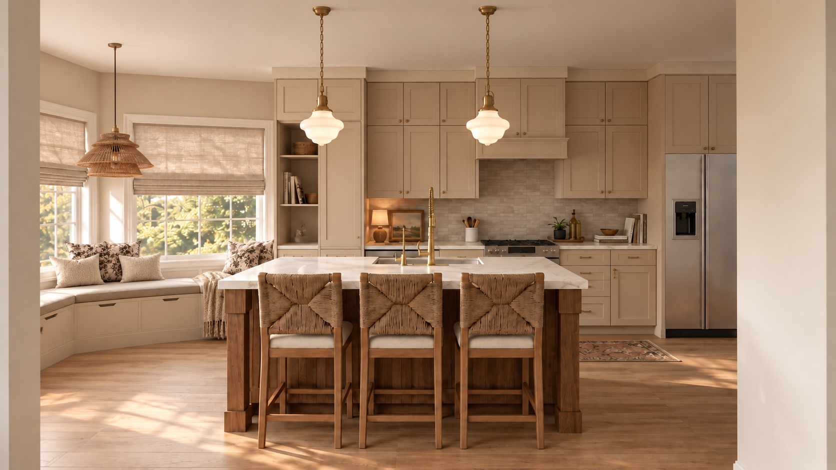
Verona Residence
A kitchen and primary bathroom in Wisconsin. In design, 2026.
Before I drew anything, I wrote down one sentence. The outside should feel intentionally invited in. Both rooms came out of it.
The kitchen
The house has more light than the kitchen was getting, and two peninsulas were the reason. One ran along the window wall, so daylight and the view into the trees stopped before they reached the middle of the room. The other sat between the kitchen and the living room, so anyone crossing between them had to go around.
A room closed on two sides reads as dark, even when its windows are good.
Both come out. What comes back is the light the house already had, a clear path between the rooms, and an island that holds the center without closing anything off.
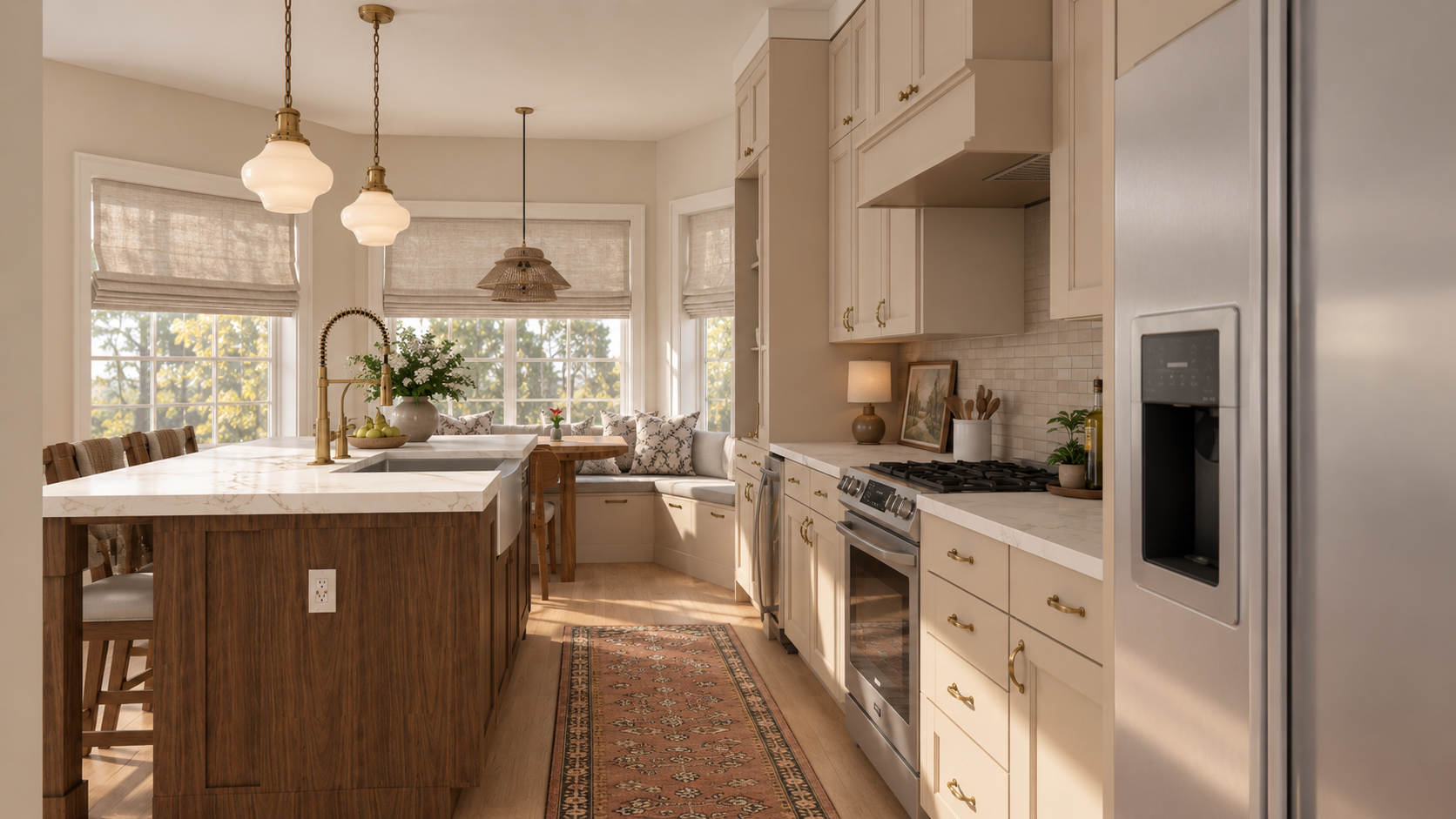
The breakfast nook
Three angled windows, and morning light arriving through the trees. This corner already had something rare in it, and the design is built to make more of that rather than compete with it.
A banquette wraps the angled wall on three sides, so your back is held and the view sits in front of you. People settle in places where they can see out and have something solid behind them. It is one of the oldest ideas in the field, and the easiest one to feel.
It is the part of this project I thought about longest.
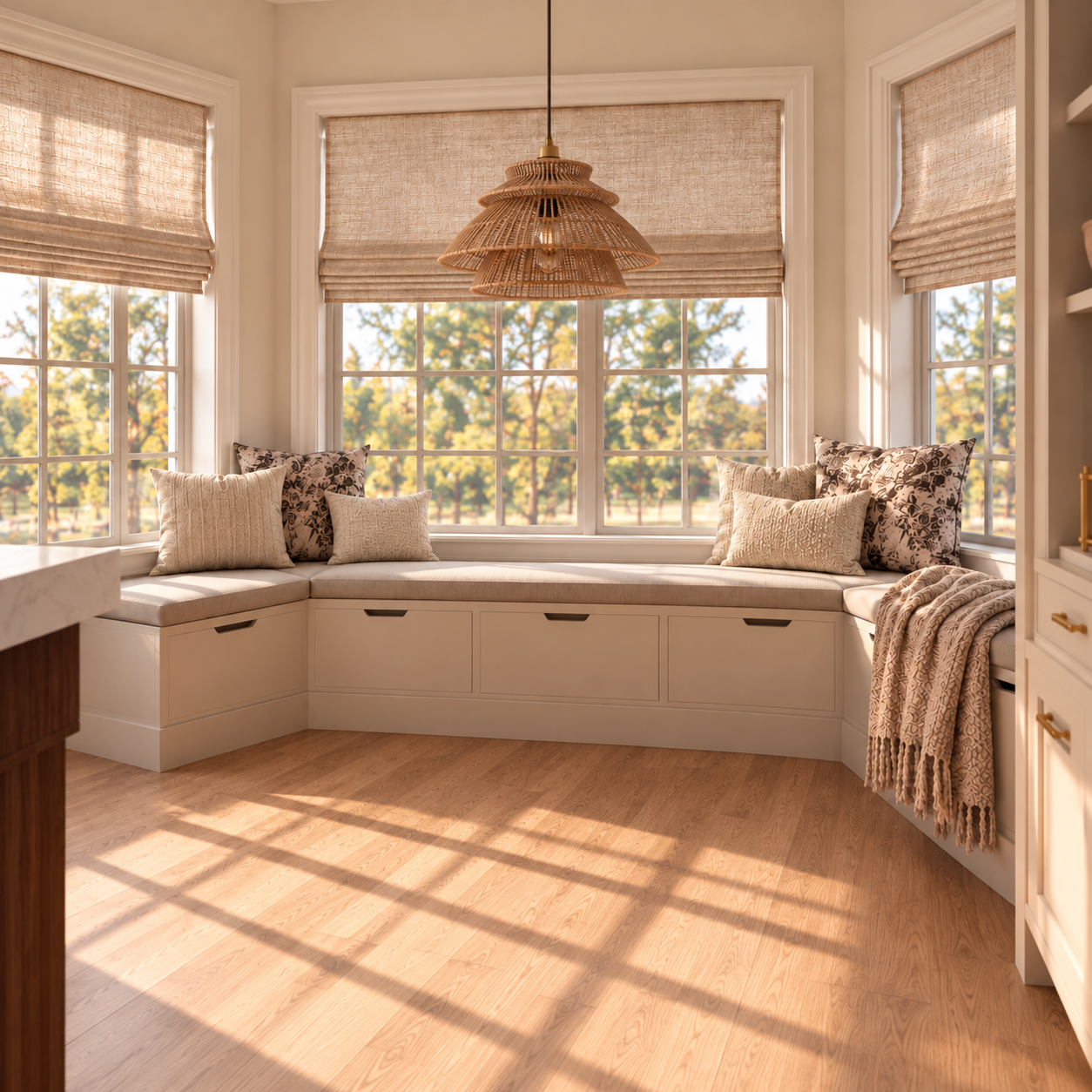
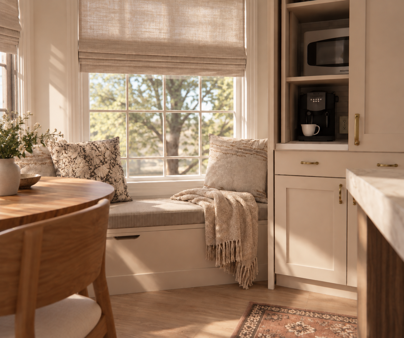
The banquette seats four to six, and stores what the season isn't using.
Coffee is a daily ritual in this house. Now it has a corner, and the main counters stay clear.
The primary bathroom
This room began with one request. A water closet with a door, so that the toilet is private. Everything else follows from finding that room inside walls that already exist.
I drew it twice. One plan took more of the space and gave back more storage. The other asked less of the house and stayed closer to what was already there. The privacy they came for is in both, so the choice was genuinely theirs. They took the second.
They also wanted a tub they would use. Freestanding or fully built-in is the usual choice, and they wanted something between the two. A back-to-wall tub is that. It reads as freestanding from the front and meets the wall behind, so there is no gap to clean, and the niche sits directly above it.
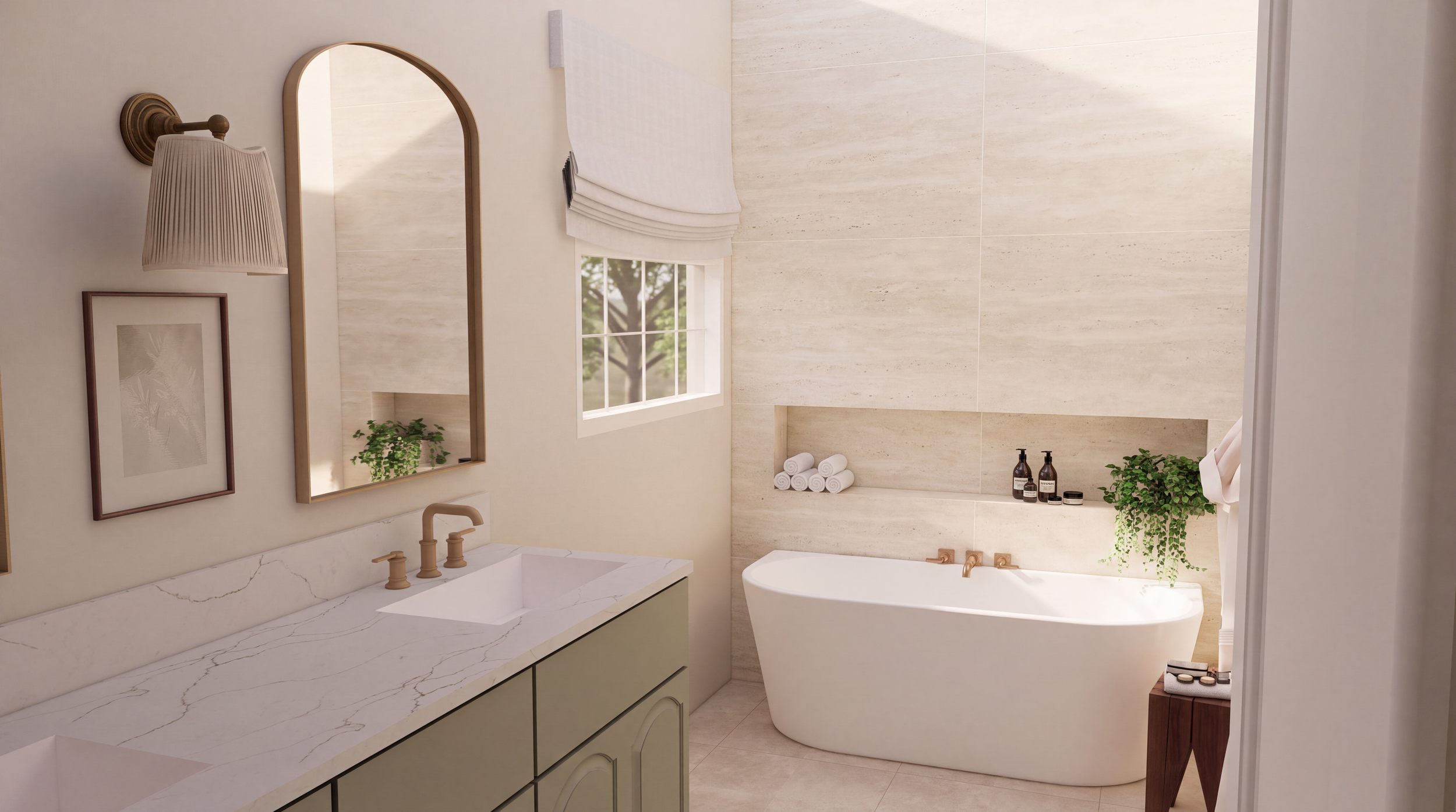
The niche runs the length of the tub, at the height of a hand reaching out of the water.
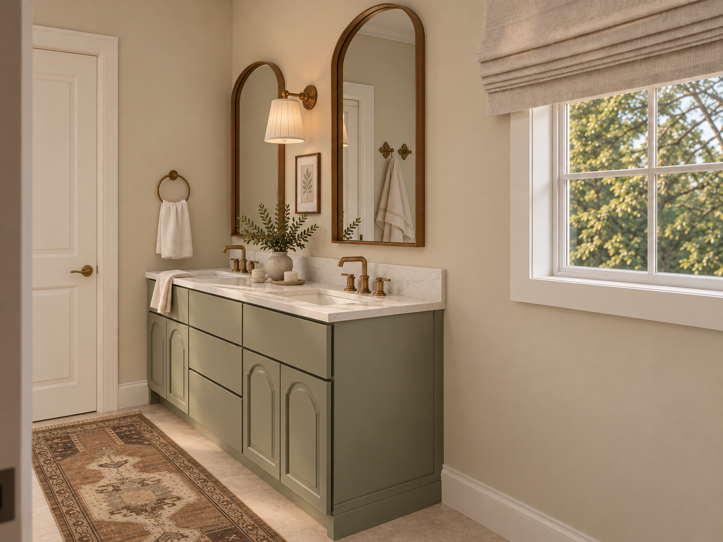
The arch above the mirrors returns in the cabinet doors, the one curve in a room of straight lines.
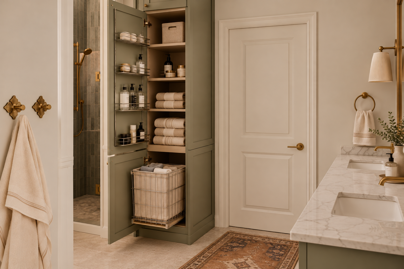
The materials
I don’t specify a finish from a photograph. A photograph won’t tell you the real color, or the texture, or how something behaves in afternoon light. You learn that by holding it.
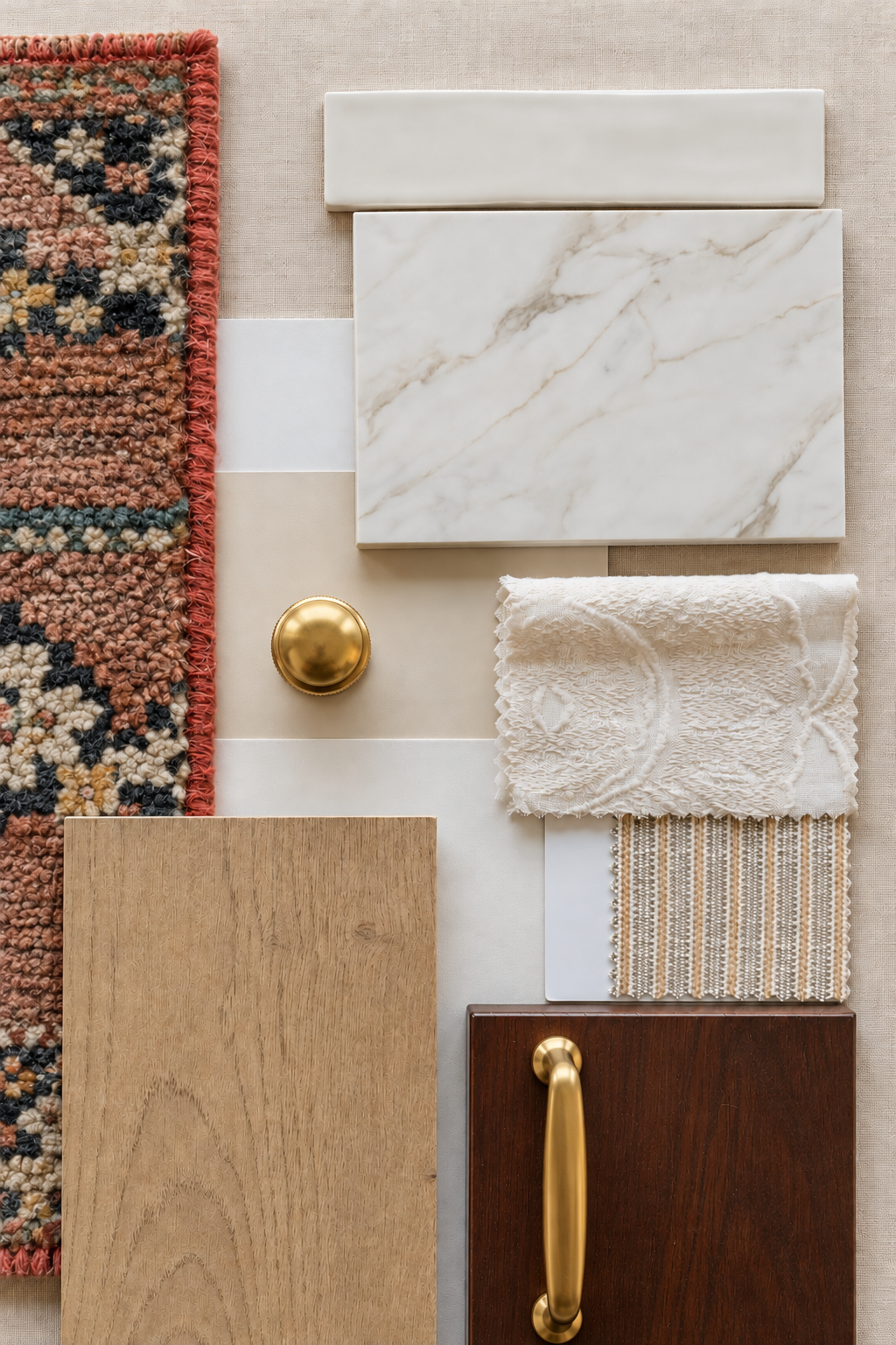
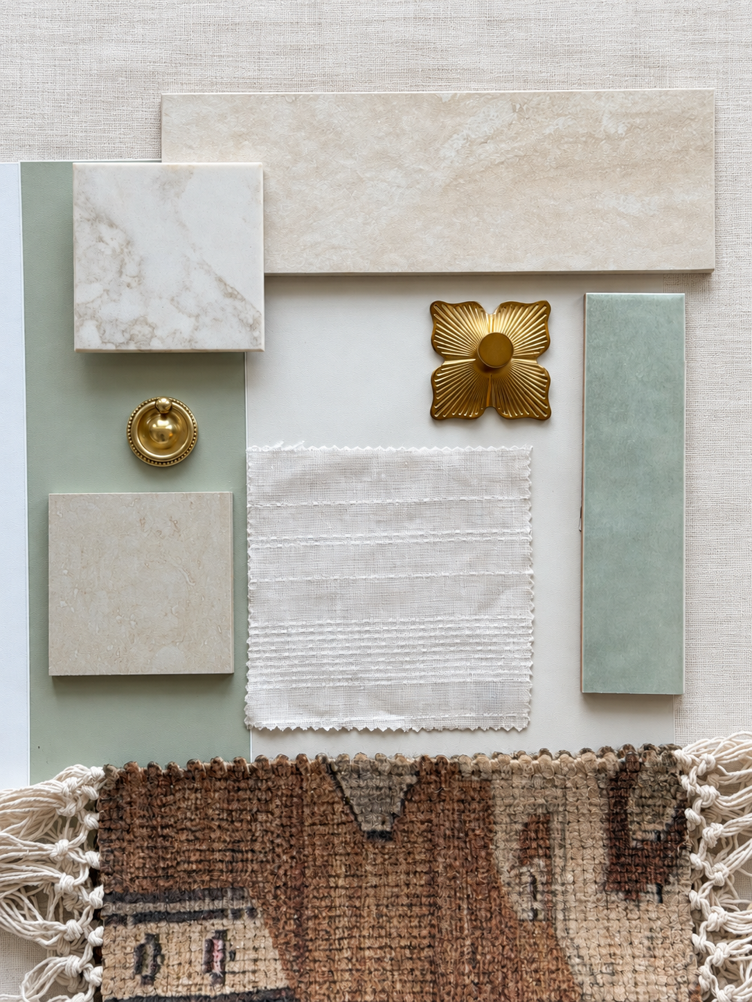
So the boards are built by hand, over weeks. Two oaks that don't match on purpose. Aged brass and heritage brass, warm rather than bright, so the metal never becomes the loudest thing in the room. Hand-fired tile with an uneven face, so the light catches on it instead of coming straight back.
And I don't ask a client to approve one from a photograph either. The countertops for both rooms, the floor tiles, the shower walls, backsplash, and the shade samples went to them, so they could hold the real thing in their own rooms, in their own light. They were undecided about the kitchen counter until it was in their hands.
The kitchen
The primary bath
Designed from Frisco
This house is in another state, about 950 miles from my studio. Plans and elevations, both bathroom layouts, every material and fixture specified with quantities, and a package a contractor can build from. The clients hold their own contractor and purchasing relationships.
That is the Virtual Design Concierge.
Design by Hasti Mirkia, PhD, The SoulSpace Design. 3D renderings of the proposed interiors, modeled in SketchUp and rendered in Enscape, with AI-assisted refinement of lighting and photographic finish. The rooms are not built yet, and I will photograph them once they have been lived in.
Begin a conversation. A first call is fifteen minutes and free.